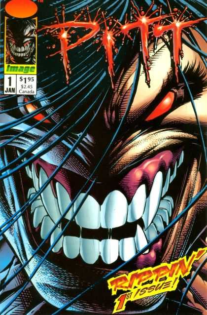
Pitt wow. I forgot how much I loved this comic. I loved Dale Keown, who is probably the best Hulk artist of the late 80's and 90's. I fell in love with his art the first Hulk he was on, and it blew me away month after month. He just expressed Hulk's strength in and power in every panel.
And when Pitt was announced I was genuinely excited. And when I got it, I loved it. in 1993 it had that image magic, combined with Dale's Heavy Metal art style and dynamism. It was raw and powerful stuff.
That was then.
Upon re-reading. Not so much. The story is pretty simple. An alien creature arrives on Earth to save us, naked, and is attacked by bikers. he kills them something awful by the way. But as savage as he is, he has a bigger role to play as our saviour. So that is the set up as the secondary characters are introduced. Cops sent to investigate Pitts appearance and bloody attack on the subway. And the boy who is having visions, who will eventually join Pitt on his savage journey to protect the world from the Creed. Who's agents show up and kill some people at the end of the issue.
The dialogue and plot are very simplistic, and really are only there to serve as an excuse to have Pitt kill and fight. Its even silly at times. But to be honest, no one picked this up for the writing. No way. What people did want they got in spades. Raw, dynamic, visceral action by Dale Keown. It powerful stuff. Pitt is scary. if not a little bit of a cliche, but scary and powerful.
I think this isn't Dale's best work. he embraced the Image style of lines and cross hatching that was super popular at the time. it was messy compared to his work on Hulk, which if I remember correctly was inked by Rubenstein(?). Messy, but full of energy. The figure work and expressions pushed to the cartoony stylistic limit. Pitt himself is awesome to behold, pretty much a simple unremarkable design..but drawn, rendered beautifully. Dale Keown is really heavy Metal in comic form. The action is intense and brutal. The layouts are simple, mostly frontal shots, and the background are more suggestions and often nonexistent. Again, this was a sign of the times. Brutal violent snarling and jumping. Ultra-huge characters with guns and pointless cybernetics or claws..basically roaring through panels for really no other reason then it looked damn cool.
all in all the re-read for the review was satisfying but very dated. Fun yet...well...unfullfilling.
I definately recommend every one who reads comics pick up his Hulk run with Peter David. It was excellent.
6 out of 10.
No comments:
Post a Comment